Father Christmas has continued his journey west and is now on the final leg of his deliveries. Like Vespucci, Columbus et. al. (Jolson, Capone, Pacino?) he is keen to learn more about this great continent before him.
He has heard that like Europe (even before Europe), competition and regulation has resulted in fragmentation in equity trading. To manage this, a miraculous solution had been created, named The Tape! The stuff of legend, The Tape offers a way for all to view prices and trades in a fair and consolidated way. That could never work in Europe, thinks Santa, muttering to the reindeer: “I mean, would you start with post-trade, pre-trade, or maybe even both…?”
So… tape or no tape, do US markets behave like European ones? Having already developed tools to compare market turnover, market share, spreads and market depth, perhaps we can discover more by taking a look at common mechanisms and if there are parallels for other market quality metrics such as Price Movement as a proxy for market impact.
Do US markets exhibit the same immediate movement following a trade as we see on lit order books and other trading mechanisms in Europe?
For those unfamiliar with our Price Movement charts – here is a brief explanation:
- The Y-axis shows time from five mins before each trade (far left), to five mins after at the far right.
- The middle of the chart is the midpoint price of the order book at the time of each trade (we capture all of these as well as all the price changes, for all stocks).
- The line shows the change of the midpoint in basis points over this 10 minute duration for the weighted average of all trades of the given aggregation e.g. venue or mechanism.
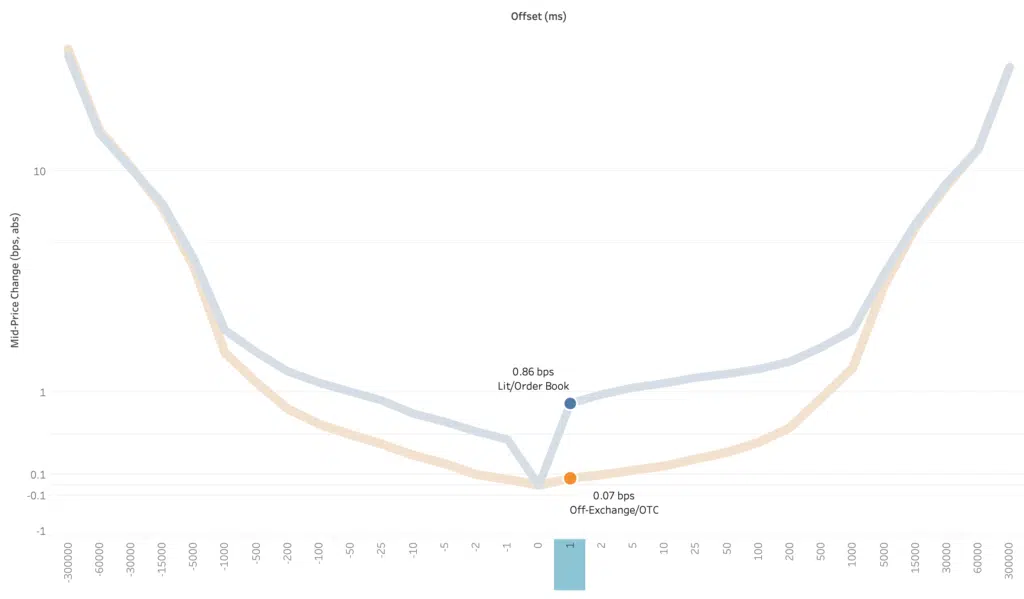
Chart 1 shows the different profile of Lit/Order Book versus Off-Exchange/OTC trades. The latter having a benign curve whilst the lit trades exhibit an immediate (within one millisecond) 1 basis point (well, actually 0.86bps) move of the midpoint caused by liquidity being taken from one side of the book or the other. (For reference the Off-Exchange/OTC price movement in one millisecond is 0.07bps. Note that this measure is not directional.)
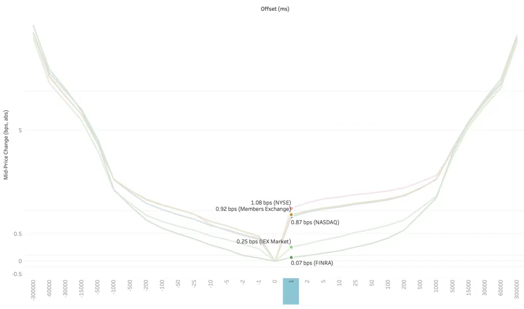
Chart 2 breaks down the order books with the FINRA tape (where we collect the Off-Exchange/OTC prints) present for comparison.
Most notable here perhaps is the less “impactful” trajectory exhibited by IEX compared to the other lit venues. This may be as a result of the ‘speed-bumps’ deployed to minimise latency arbitrage.
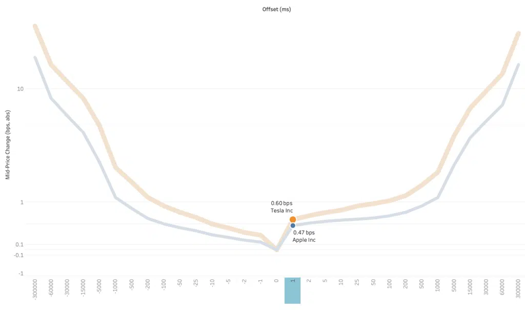
The final chart takes the analysis down to stock level on a single venue (NASDAQ) as we compare two stocks that are amongst the most actively traded in the US. Despite them having a lot in common, there is a visible difference to their lit trading profiles. It may not look much but it is a 30% difference after one millisecond. Many considerations come into play when looking at these transaction costs for different stocks; volatility, liquidity, spread, market impact, even tick sizes….but more of that in a future post.
Santa is finally approaching the finish line but despite the value of a tape he is not sure if it provides all the information required to identify the winner.
****
All the content here has been generated by big xyt’s Liquidity Cockpit dashboards or API.
For existing clients – Log in to the Liquidity Cockpit.
For everyone else – Please use this link to register your interest in the Liquidity Cockpit.


