A sudden recovery in trading volumes in the energy sector is just what we would have expected from the news of the vaccine last week, and it’s in line with the broader market.
The news may only be a light on the horizon, but a return to normal levels of trading activity will show that investors are returning to the stage.
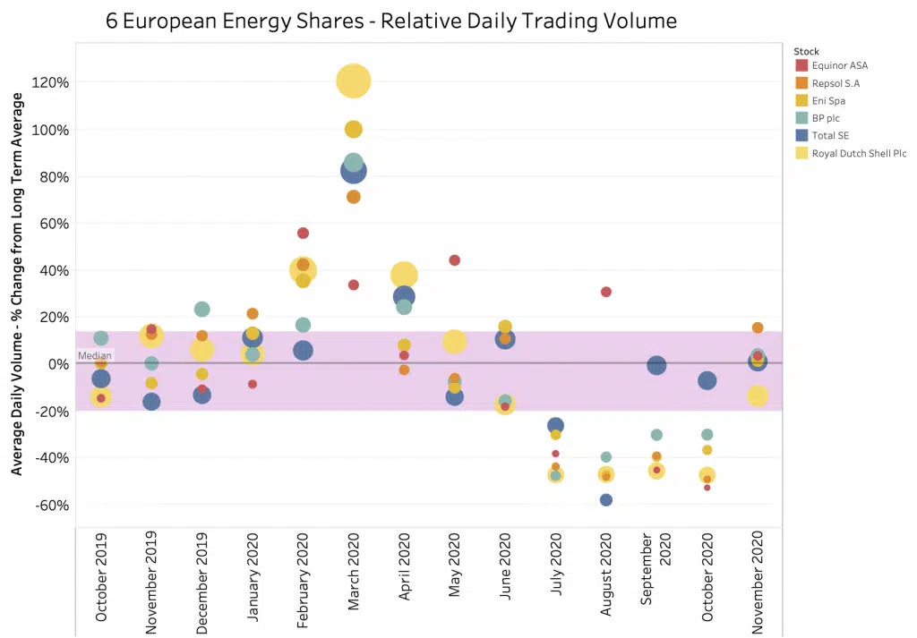
The bubble chart shows the relative difference between each share’s average daily volume per month versus the average daily volume for the whole period, beginning in October 2019. The size of the bubble shows the average daily volume in euros for each month. For example, a normal range for Royal Dutch Shell Plc is around 800M€ to 1050M€ per day.
This grew to a massive 2,100M€ during March before falling to 510M€. The sector is trending towards its long-term range, with Repsol slightly above.
As commented previously, the great wave of sell offs in Q1 was accompanied by record trading volumes, followed by a dearth of activity in the months from July to October. In at least one example, it seemed that even share re-purchases and cancellation schemes couldn’t stem the tide.
With shares back in favour, this time we are seeing volumes climbing with demand and returning to long term average levels. As such, we felt an update was required. As market capitalisation rises in this sector where prices fell relatively more than other sectors, we can also expect more volumes coming as passive managers begin to re-weight their portfolios if the recovery is sustained.
As usual, please let me know if you have questions or would like further data. The graph has been taken from our Liquidity Cockpit tool and is better viewed online.


