Market participants can use a clever technique to avoid arguments over equity and impartiality by applying a well recognised and altruistic benchmark called the Value Weighted Average Price (VWAP).
Those seeking a fair price in an equity often target the VWAP as a safe participation proxy which utilises the historical volume distribution curve as a guide.
At big xyt we agree that this is helpful and our team further realised that this volume curve should be broken down by mechanism (how are the shares trading?) and venue (where are the shares trading?) for each distribution bucket.
That helps us to understand the historical profile in more detail, but what is happening TODAY could be different, perhaps influencing how much volume we might want to reserve for the all-important closing auction.
The approach our team takes to normalise, cleanse and analyse the data can now be applied to real-time data feeds (not just to historical data processed overnight), resulting in the ability to draw today’s volume curve instantaneously.
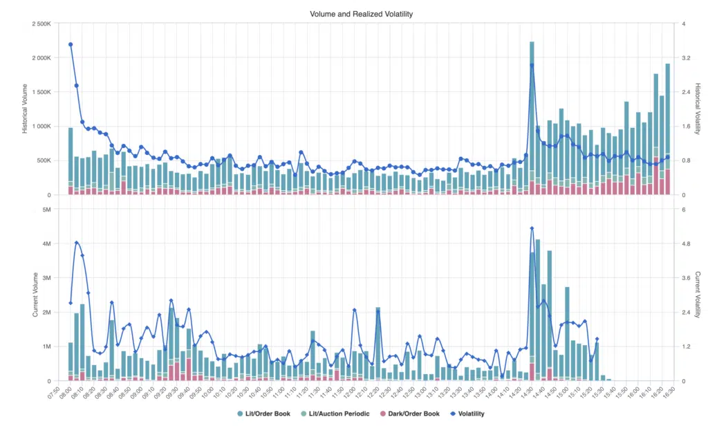
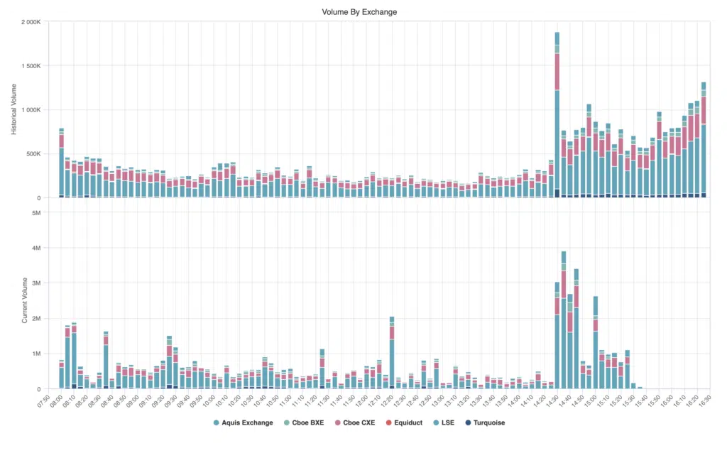
In Chart 1 we see the historical average above the dynamic curve for today, each broken down by mechanism, whilst Chart 2 shows a similar comparison broken down by competing CLOB venues. Note: for good measure Chart 1 is tracking historical and realised volatility as well.
Volume Profile by Mechanism
Volume Profile by Venue
Charts are a snapshot up until 3.30 pm
Incidentally (for those interested in venue time spent at CBBO), our T0 (real-time) delivery also means we can calculate Presence in the present as well as in the past, and we may well roll it out for futures.
****
All the content here has been generated by big xyt’s Liquidity Cockpit dashboards or API.
For existing clients – Log in to the Liquidity Cockpit.
For everyone else – Please use this link to register your interest in the Liquidity Cockpit.


