At this time of year, we work hard to ensure that we don’t disappoint our friends and relatives on the big day. We order the food and drink well in advance, we carefully choose the gifts, and we stock up on spare batteries for the remote control. It’s all about avoiding disappointment by creating certainty.
In fact, it’s not unlike the day job. Whether we’re investing or trading, we like to create certainty by using data to spot trends and patterns that will help us, at least in part, to predict what will happen in the future. On Day 4 of our festive trot around the globe for 2022, we take a look at some data from the South African market to assess how prices evolve in response to trading activity.
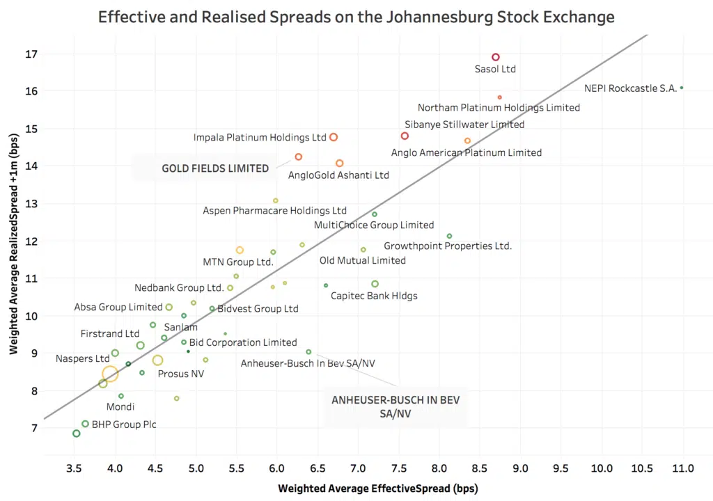
In today’s chart, we compare ‘Effective Spread’ and ‘Realised Spread’ in the most liquid listed names on the Johannesburg Stock Exchange (JSE) over a period of two months. Effective Spread is the difference between the trade price and the MID at the time of execution. Realised Spread is the difference between the trade price and the MID at some time in the future – here we use a one minute interval.
Comparing these two measures allows us to gauge how much we can expect the share price to move following our trade (either to our advantage or disadvantage). Under more volatile price conditions the difference will increase, and vice versa. This is a more informative measure of expected trading cost than using the simple ‘Quoted Spread’ (the difference between the BID and the OFFER) because it accounts for price movements subsequent to a trade. It is therefore more precise in predicting expected trading costs and in benchmarking performance. Other measures, such as Price Reversion, can be used to build a picture of whether price movements are favourable or unfavourable.
From the chart, we can see the strong relationship between these measures and also how volatility affects the spreads (the colour coding shows green for the lowest volatility and red for the highest). The size of the circle denotes the value traded. Take for example, Anheuser Busch SA and Gold Fields Ltd, which have very similar Effective Spreads but very different one minute Realised Spreads. Gold Fields has much higher volatility and therefore Realised Spread. While the picture tells an unsurprising story, it underlines how every stock has its own characteristics, and the need for detailed security level analytics to measure how they change over time.
This data was prepared in collaboration with the JSE, as part of a project to deploy a suite of analytics that are now available to its member firms on a daily basis. These analytics provide extensive insights to traders in how their order flow interacts with the market, and we believe is the shape of things to come in exchange provided information services.
****
All the content here has been generated by big xyt’s Liquidity Cockpit dashboards or API.
For existing clients – Log in to the Liquidity Cockpit.
For everyone else – Please use this link to register your interest in the Liquidity Cockpit.


