These days it seems to get harder and harder to pick a really new and exciting Christmas present for your parents, spouse, friends and of course the kids. They’ve all got everything already and if you ask them they just say “Dunno really!”. The elves have to concentrate really hard to come up with something different and unique, so that Santa can spring a stirring stocking surprise.
Well this year, the 12 Days team has reached deep into Santa’s sack, had a rummage, and found something really unique. Courtesy of our partners at the Johannesburg Stock Exchange we present a highly insightful dataset that only a trading venue can produce. This is golden source data that emanates directly from an exchange matching engine and in this case is provided by the JSE Trade Explorer service, which is powered by big xyt.
The dataset contains a breakdown of trading activity between principal and agency traders and provides information on liquidity patterns and trends. We measure the proportion of traded value that is matched between agency traders, between agency and principal traders or between principal traders. Assuming that agency traders represent natural liquidity flowing into the market, a higher proportion of agency matches implies that supply and demand are relatively well matched and the market is liquid on both sides. Conversely, a higher proportion of agency to principal matches implies the opposite with market makers (among others) stepping in to provide liquidity. These conditions imply higher spreads and implicit trading costs as market makers require a risk premium for their services.
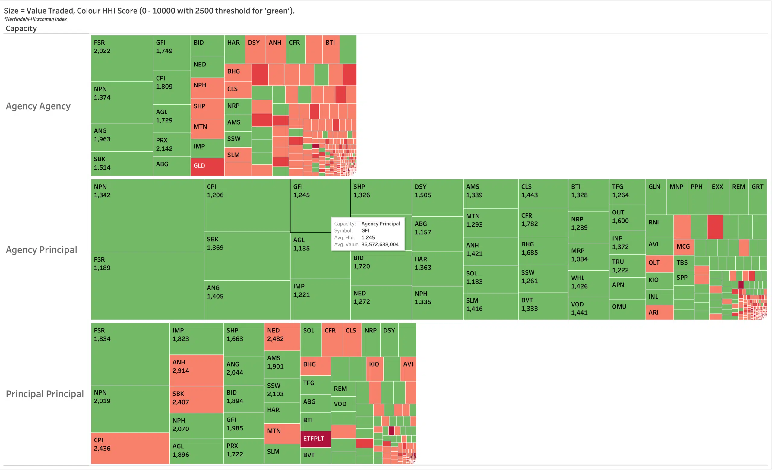
The chart below provides a taster. It is a historical snapshot of the data segmented into the three categories. The size of each block represents the average daily value traded per symbol. We can see for this period that agency to principal trading makes up a little under half of daily traded value for the whole market.
It’s not a perfect science; the principal category also carries natural flow such as with swap execution, and the agency category carries liquidity provider flow especially through DMA channels. Looking at the historical trend using more granular data, such as by trading session, side and the intraday curve adds even greater insight.
But what do the colours represent? Now it gets even more unique and insightful. We can count the number of participants present in each of the categories, and use their market share to determine the concentration of each type of liquidity. For example, if there are many market makers (inside the principal capacity) competing to make prices we see a tighter spread – an indication of a liquid order book and thus lower implicit trading costs. This concept of ‘market concentration’ is captured using a Herfindahl-Hirschman Index (HHI) technique, which is a common measure used in economics to determine the competitiveness of a market. The index value per stock is shown in each cell. A lower index implies higher liquidity as illustrated in the graph, where the most liquid names are bright green (very Christmassy!). Smaller illiquid names that may trade only once a day appear in red. HHI techniques and other similar metrics can be applied to these unique datasets to extract even more value, for example in determining clusters based on stock characteristics for use in the algos.
This kind of dataset is a showcase of how exchanges can leverage their unique data resources, providing insights to trading firms and investors alike which ultimately leads to improving their market quality, serving the investor and attracting issuers. Today’s example is just one among many of a unique dataset and value added metric that can be created by an exchange for both their members and the wider community.
We have launched a partnership with the JSE called big xyt ecosystems to help other exchanges in this field by deploying the JSE Trade Explorer service. Please let us know if you are interested in hearing more about this service.


