The presents have been unwrapped, the Bellini glasses have been drained, the kids have gone back to their rooms and the out-laws are about to arrive. After a relentless pre-Christmas week at work, it’s hard to concentrate on the tasks at hand; the sea of ripped Christmas paper (applied to its subjects only a few hours ago) and now it’s time to peel the sprouts. The mind wanders onto the topic of whether your presents were bigger and better than everyone else’s (as you deserve).
It gets you thinking about that last management committee meeting of the year when you had to explain that despite a terrible year for volumes, your desk has done remarkably well and managed to capture market share.
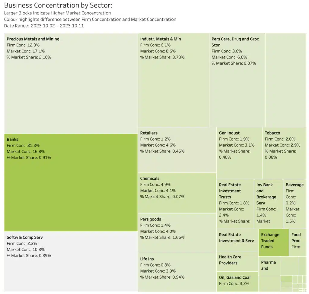
In our chart of the day, we show the ‘Concentration Heatmap’, which compares a make-believe (it is Christmas!) trading firm’s business concentration with the overall market concentration (the market is also make-believe).
The heatmap shows the distribution of trading volumes across all sectors in our make-believe market. The bigger the box, the greater the volumes concentrated in that sector. The colour of the box represents our make-believe firm’s distribution of trading volumes in each sector. The brighter the colour, the more the firm is concentrated in a given sector. In our example, the firm has particular strength in the Banks sector, which is also where the market flows are concentrated, and in the ETF segment, which seems to be a specialisation.
Given sector cyclicality it is crucial that management pays close attention to the ebb and flow of sector dominance and growth patterns and keeps the business aligned to that pattern. It is also crucial to understand where and how volumes are changing within the market structure (for example between auctions and intraday trading and between automated and off order book trading, which also drives the distribution of volumes (aka revenues)).
This dataset (and the resulting insights) can be very tricky to produce. For example, do you include on-order book liquidity only as a proxy for the whole market? That might be a valid assumption for your electronic desk, but not for the high touch business or prime business lines, especially with off order book trading growing so fast around the world.
To achieve this kind of business intelligence needs a very accurate picture of all addressable liquidity, and the ability to combine it with your own data.
If you are interested to know how we do this, and you think you can benefit from this kind of insightful visualisation, please let us know.
****
All the content here has been generated by big xyt’s Liquidity Cockpit dashboards or API.
For existing clients – Log in to the Liquidity Cockpit.
For everyone else – Please use this link to register your interest in the Liquidity Cockpit.


