Whilst the Italians enjoy a good hearty feast on Christmas Day, traditionally they give and receive gifts on January 6th – the 12th Day of Christmas. There was a big Italian gift in the spring of this year too when ownership of Borsa Italiana was transferred (for a small fee) by LSEG to Euronext.
Given this change and the implications of Brexit for European exchanges and venues, it occurred to us that it might be interesting to take a look at the Italian market to see if things have settled back to (the new) normal.
Over the past few days we have looked at market volumes by venue and legislation as well as trading mechanism, so now our clever data scientists can provide a way to look at changes in market quality over time.
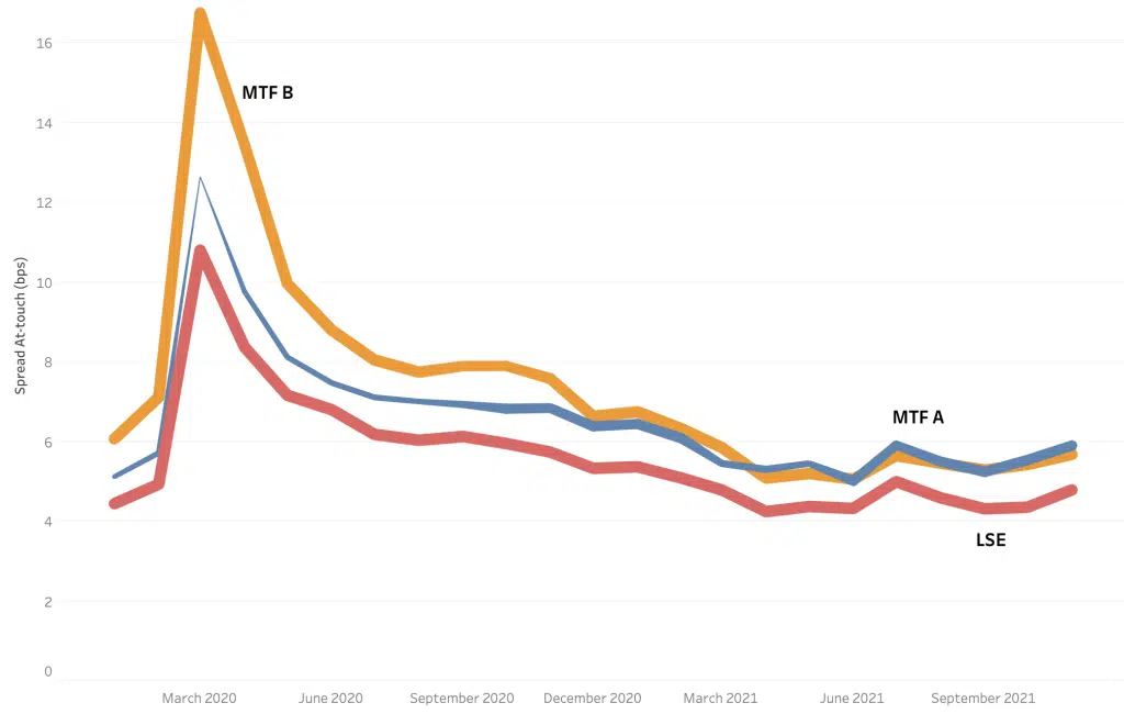
Taking the UK market to begin with (as there was no need for new lit MTFs to be set up as they were already present), we can see how At Touch spreads have changed for UK blue chips since January 2020. Huge volatility in the spring of that year caused spreads to widen dramatically before settling back over a long period of time to close to where they were before the pandemic began. Note the thickness of the lines shows the measure of presents (Presence/Time at Touch) across the venues over time.
Chart 1
Unsurprisingly, we always observe the primary exchange as having the tightest spreads overall and we have shown two anonymised competing MTFs for comparison.
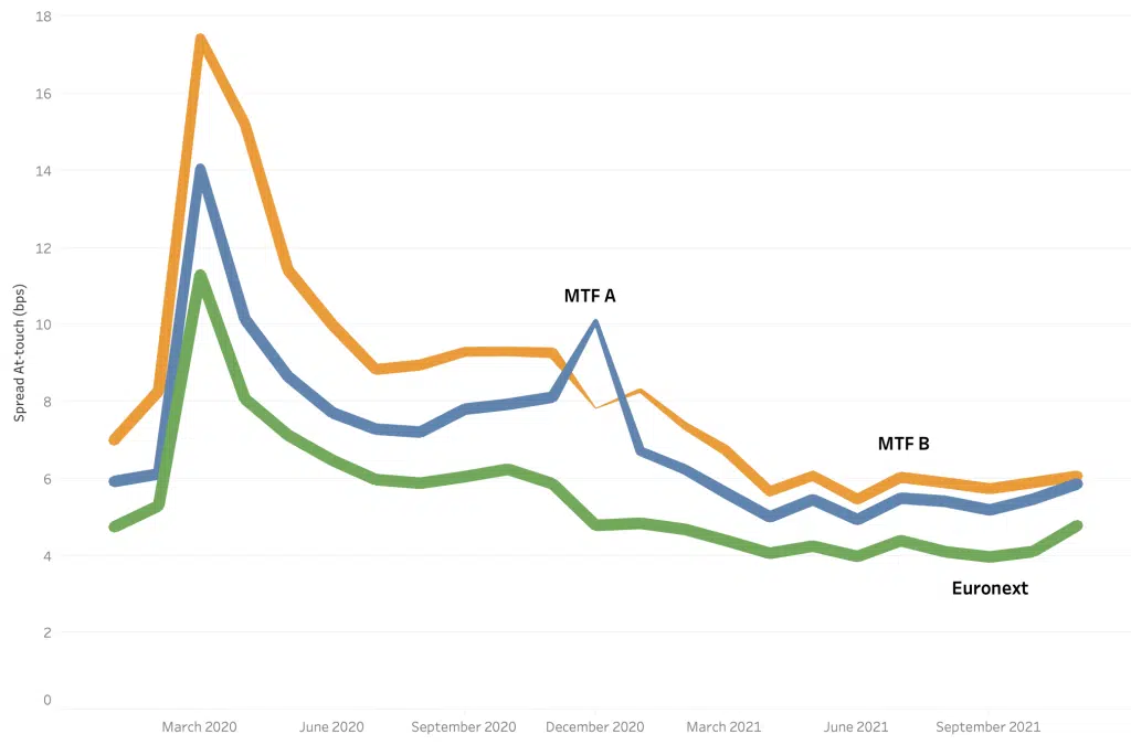
In the second chart, taking a look at the top 40 Italian stocks, we see Euronext (Milan) as the primary exchange. Now, this is where our mathematicians have done something very clever and bow tied together the pre-Brexit spreads for each UK-based MTF to their sister EU venue, post-Brexit, thereby creating a continuous measure of At Touch spreads on each respective venue. As a result, during the Brexit transition period, we can observe a narrowing of the spread on the primary with presence maintained and a ‘blip’ for both MTFs along with a short period of reduced presence as they transition to their new home.
Chart 2
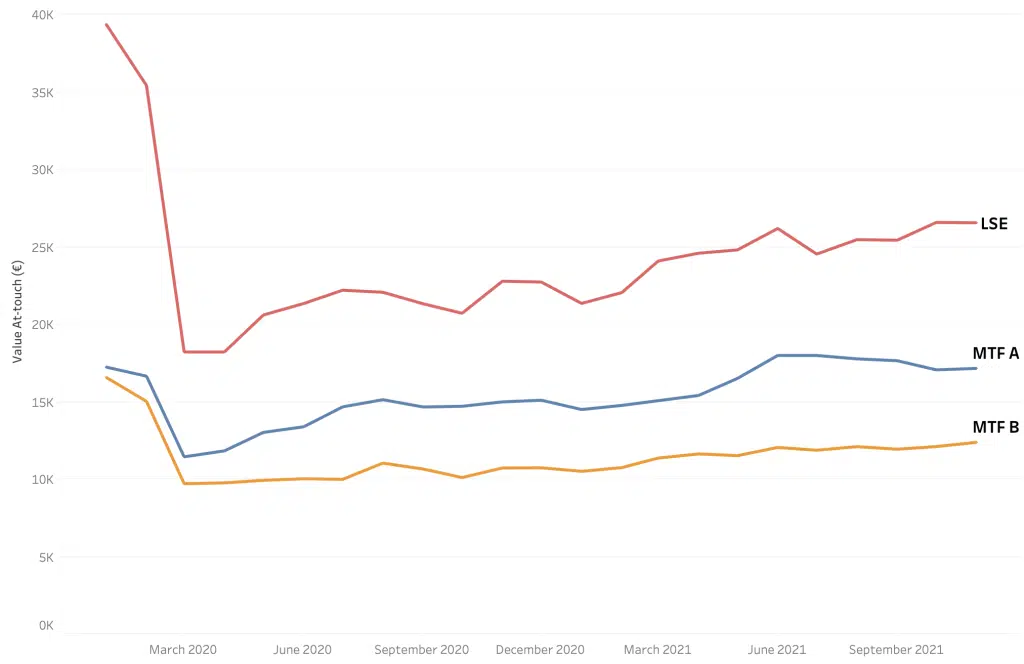
Chart 3 shows another market quality metric – Value at Touch (this is the average sum of the available liquidity on both sides of the touch price) for the top 100 UK stocks. Once again, the volatility during Q1 2020 is apparent as available liquidity on the LSE drops by over 50%, and like spreads, takes a long time to recover; in fact, struggling to reach the levels prior to the pandemic. It‘s a similar story for the MTFs.
Chart 3
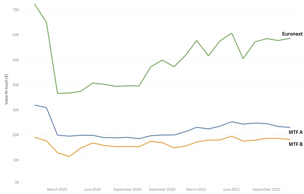
The final chart tracks the same metric for Italian blue chips. The Q1 2020 volatility triggers a similar decrease in available liquidity on all venues, but the MTFs transition through the Brexit-induced changes are barely noticeable as all venues gradually recover, but, like the UK, to nowhere near where they were before.
Chart 4
So normal service has been resumed, and the Borsa Italiana has changed hands without a hitch. We can all sit back relaxed and reassured, but remember only dip biscotti in Vin Santo, not in coffee.
****
All the content here has been generated by big xyt’s Liquidity Cockpit dashboards or API.
For existing clients – Log in to the Liquidity Cockpit.
For everyone else – Please use this link to register your interest in the Liquidity Cockpit.
Oh and one last thing: We’ve been nominated in the A-Team’s TradingTech Insight Awards Europe 2022, in the Best Transaction Cost Analysis (TCA) Tool and the Best Trading Analytics Platform categories. Please vote for us here.


