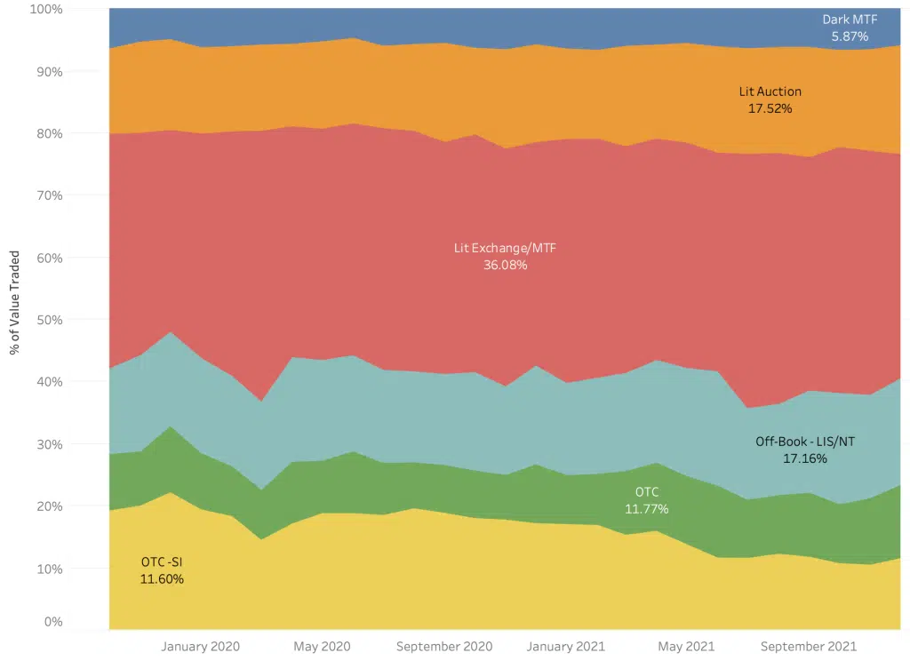
When Santa visited us for one of our academy sessions, Market Structure for North Pole Inhabitants, we provided an initial introduction to European market structure using the following chart for European Equities by trading mechanism, which may be familiar to many of you:
Chart 1
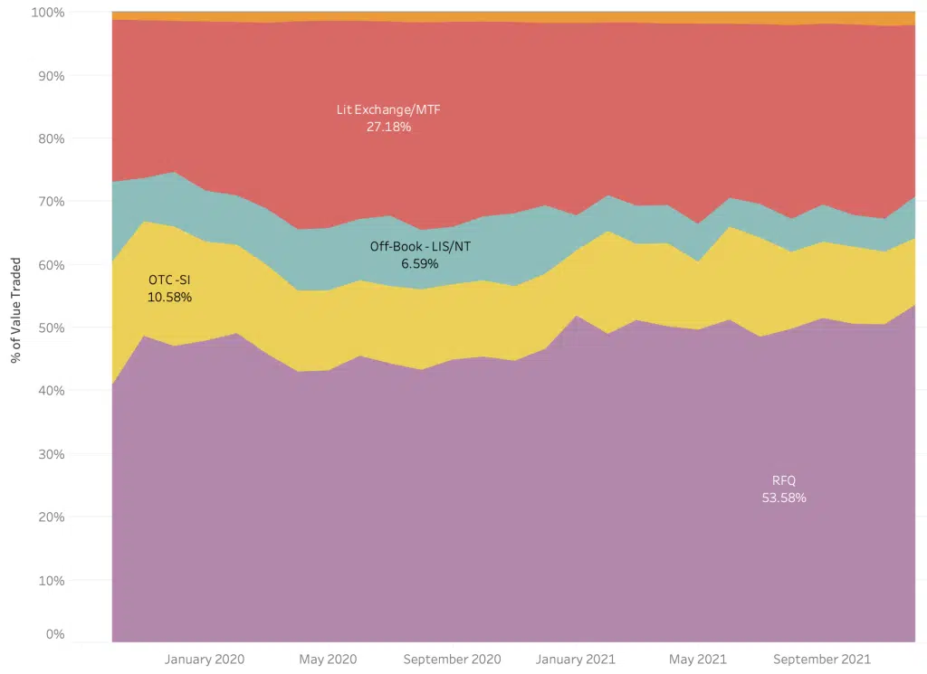
Santa soon understood that, but as a wise man, he remained curious – one of the questions he asked was about ETFs: “If these equity-like instruments are called Exchange Traded Funds,” he asked with a glimmer in his eye, “Why do they trade less than 28% of their volume on exchange compared to 53% for vanilla equities?”
Thankfully, we were able to check this using the Liquidity Cockpit for ETFs and saw the Ho-Ho-Whole picture for European listed ETFs. As you can see below, he is absolutely correct. RFQ platforms eat up a huge slice of the mince pie whilst they are barely visible in traditional equity land.
Chart 2
Santa went on to ask; “If the community (including the regulators) is worried about pre-trade transparency for equities and off-book activity undermining price formation, why do investors trade ETFs in such a different way?”
We sat down with Mr Claus and identified that some of this difference is explained by liquidity, and that while the ETF market is designed to be similar to equites for secondary trading, the primary ‘issuance’ process has different characteristics. Issuers, through market intermediaries, can create and redeem ETFs to meet supply and demand.
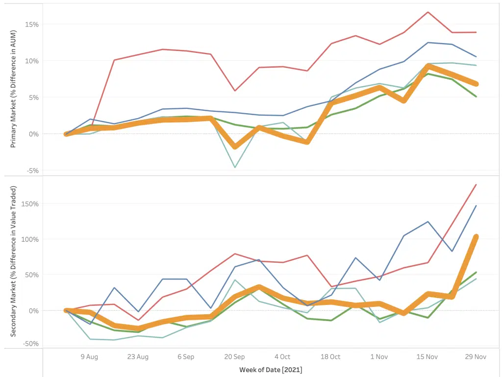
The two charts that follow paint the picture for the five largest ETF issuers (anonymised) for pan European ETFs.
Chart 3
The top section shows the growth by issuer in AUM (assets under management) during the second half of the year. This shows steady growth for all (if you would like to know the identity of each, please get in touch), and at the end of November, a nice illustration of how a mini market shake-out hits the value of the underlying, with some people heading for the door as redemptions were triggered by market nerves. Incidentally, the thickness of the line, for those that spotted it, represents the total AUM for each issuer.
The second chart shows secondary market activity for the same issuers.
Interestingly, during late November the trading volumes increased as secondary activity moved in the other direction to primary as AUM declined.
A snapshot does not always provide the full picture which is why we always try to show trends over time and the view from another perspective.
We think these market trends can expose some crazy behaviours. In fact, to avoid being taken to court, it might be wise for some venue operators to invoke a sanity clause.
Our Liquidity Cockpit for ETFs solution allows a drill down to security level across currencies and venues, or indeed comparisons of market quality by underlying benchmark across issuers.
****
All the content here has been generated by big xyt’s Liquidity Cockpit for ETFs dashboards or API.
For existing clients – Log in to the Liquidity Cockpit for ETFs.
For everyone else – Please use this link to register your interest in the Liquidity Cockpit.
Oh and one last thing: We’ve been nominated in the A-Team’s TradingTech Insight Awards Europe 2022, in the Best Transaction Cost Analysis (TCA) Tool and the Best Trading Analytics Platform categories. Please vote for us here.


